We are pleased to announce a new version release.
Thanks again for your feedbacks, they prove to be very useful.
I hope you’ll enjoy this new one, feel free to report every problem/suggestion.
List of major changes after the break…
 ElvenProgrammer
We are pleased to announce a new version release.
Thanks again for your feedbacks, they prove to be very useful.
I hope you’ll enjoy this new one, feel free to report every problem/suggestion.
List of major changes after the break…
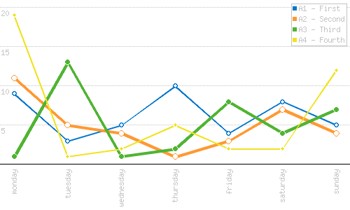
In another attempt of increasing my website page ranking and SEO, trying to understand the trends of my followers, I decided to improve my download statistics page.
The old one used to be a custom page where I needed to develop some easy charting tool (PHP lines graph tool).
Time passed and I decided to try a new approach, and one of the best examples I could find around was Google Analytics. Unfortunately the flash based chart inside analytics seems to remain a secret, but Google offers not one, but two free services to create your own charts (In my case line/area charts).
The first one I found was Google Chart Image APIs which works very similar to the php script I developed, of course it is a lot better and supports a gazilion of features.
I was quite satisfied, but suddenly, while looking for some more documentation, I stepped on Google Chart Tools. Actually that’s even more interesting.
Just to say some of the cool features it adds:
Continue reading to uncover image and source examples of the two approaches compared
Ok, by this time, the title should have attracted your attention 🙂
I’m a real fan of “The Big Bang Theory” TV show (I strongly suggest you start watching it if you didn’t yet), and I fell in love with Sheldon’s and Leonard’s shirts.
I wanted to buy a couple of them and I was sure to find some good examples around the web, but none of them seemed to satisfy my need to be nerd because of the price, USA shipping only and so on…
So (as a bit more often do), I decided to draw the logos myself and let them be printed by a local shop.
I opened up Inkscape and GIMP and here’s an example of what I got:


You can taste more after the break
Not much of an update, but I improved my php script to generate lines graph.
Since I had the need to display more than one graph at once, here comes version 0.2.0, togehter with some other nice new features

Since I was tired of creating ugly bar graphs I decided to explore an easy way to create a lines graph, mostly inspired by Google Analytics graphs. Ok nothing so advanced but the result is quite nice for my needs.
You can configure the image created by the script using the following parameters:
Following a couple of examples with parameters used:
graph.php?w=500&h=300&points=9,3,5,2,4,8,5 &labels=mon,tue,wed,thu,fri,sat,sun&rows=4 &color=0,119,204&style=1Today I needed to take a lot of screenshots and I wanted something better than Alt+Print Screen and quicker than The GIMP. So I ask our system administrator and he says: “What the hell you want?”, and after a while: “Sure we have a very nice tool”. “Cool, can you install it on my laptop?”. He smiles at me and says: “I’m sorry but we ran out of licenses”. And here ends the part of the conversation I can safely write about.
So I start looking for free alternatives on the web, even if “someone” told me not to install unauthorized software. But wait, I’m a programmer right? So I start looking how hard would it be creating such a tool. And once again C# comes to the rescue. After 5 minutes and a couple of lines of code sharpcapture is born. And also makes sysadmin happy.
You can get binary/source package from: [download#2]
I finally found some time to work on forum theme. This one should blend more with the main website.
I hope you enjoy it. If you can’t see it, go in your user control panel and select elvenprogrammer2
As you may have noticed (or maybe not), I did some restyiling to my website. I also added some underlying functionalities that should help me keep it more updated.
Happy browsing